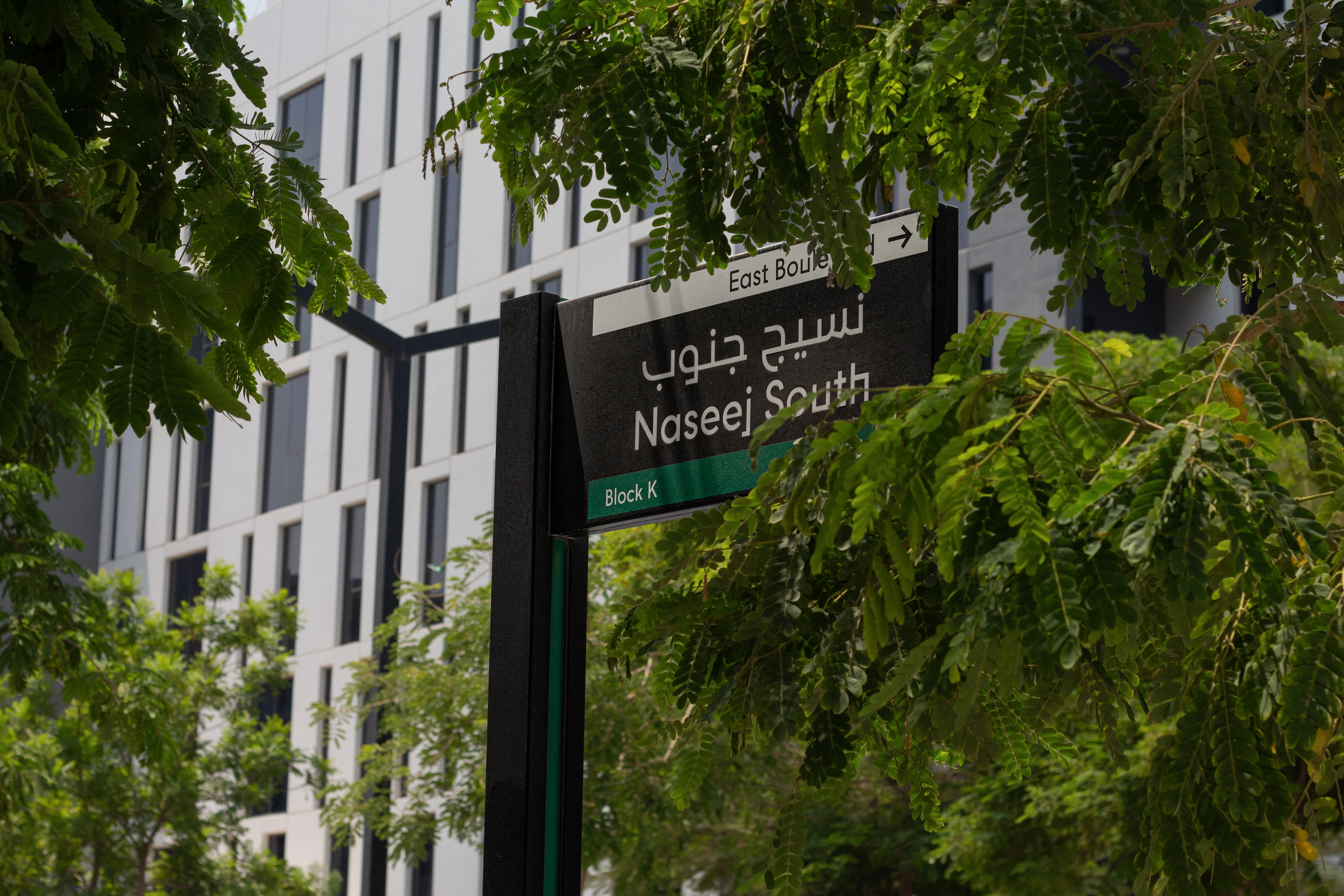




By the time someone stops and searches for help, the environment has already failed to explain itself.
This is why wayfinding and navigation design cannot be reduced to signs. It is the system that helps people orientate, decide, move and arrive. It connects the spatial structure of a place with the way people think, behave and act under real conditions. Signage is one part of that system, alongside architecture, landscape, lighting, landmarks, naming, information, digital tools and human support.
The aim is not to describe every possible route. It is to give people enough understanding to make the next correct decision with confidence.

Wayfinding and navigation design is a decision system
People do not experience a building as a plan. They experience a sequence of choices.
Where do I enter? Am I in the right place? Which destination name applies to me? Should I go up or continue ahead? Can I use this route? How will I know when I have arrived?
Each question is a decision the environment asks the user to make. Wayfinding & Navigation determines how those decisions are structured, what information is available at the moment of choice and how progress is confirmed afterwards.
A strong system creates a chain of confidence. The approach establishes expectation. The arrival confirms identity. The entrance creates orientation. The route reveals what comes next. Each decision point provides the right choice at the right time. Reassurance along the way tells the user that the journey is still working. Arrival is clear enough that no further interpretation is required.
When one link fails, confidence weakens. People slow down, retrace their steps, follow other people, ask staff or rely on a phone. These behaviours are often treated as individual error. In reality, they are evidence that the place has transferred too much navigational work to the user.
The first task of wayfinding is therefore to reduce unnecessary decisions. The second is to make necessary decisions easier to understand.
Complex places become difficult when users must solve the plan
Complexity is not automatically a problem. Airports, hospitals, campuses, mixed-use districts, cultural destinations and transport interchanges all contain many routes, functions and user groups. They can still feel understandable when their organising logic is visible.

Difficulty appears when the structure makes sense mainly to the people who designed or operate it. Project teams know the plan, the tenant mix, the departmental structure and the internal language. A first-time visitor knows none of these things. They must infer the logic from what they can see, read and remember while continuing to move.
A building may be technically connected yet perceptually fragmented. Two destinations may be close on plan but feel unrelated because there is no visible connection between them. A primary entrance may sit beside a more visually dominant service opening. A lift may serve the correct floor, while the directory uses a destination name that differs from the booking confirmation. Each element may be correct within its own scope, but the journey fails between scopes.
Adding more instructions rarely resolves this kind of problem. It can increase the amount of information users must process without correcting the underlying ambiguity.
Wayfinding & Navigation looks for the human logic beneath the plan. It asks whether users can recognise the hierarchy of places, understand the main routes, anticipate what happens next and recover when conditions change. The objective is to make complexity legible rather than pretend it can be removed.
Orientation begins with a mental model
Before people can choose a route, they need a working idea of where they are and how the place is organised. This internal understanding is often called a cognitive map. It does not need to reproduce the architectural plan. It needs to be simple, stable and useful.
People may understand a place through a central spine, a series of districts, a prominent atrium, a coastline, a mountain, a transit line, a sequence of courtyards or a small number of memorable landmarks. These reference points allow them to relate one part of the environment to another.
Good spatial orientation strategy strengthens the simplest useful model. It considers what people can see on approach, where they first gain an overview, which features can act as anchors and how zones or levels are differentiated. It also considers whether the same logic survives across maps, signs, digital directions and staff language.
This matters because a person who understands the structure can make informed decisions even when a specific instruction is absent. A person who has only been told to follow a series of arrows remains dependent on the next message. If one message is missed, the journey can collapse.
Architecture has a direct role in this. Visibility, thresholds, route continuity, vertical connections and destination prominence all shape the mental model. Wayfinding input during planning can identify where spatial changes would create greater clarity. Later communication should reinforce that logic rather than invent a separate one.
Route hierarchy reduces the number of choices
Every route should not carry equal navigational weight. Understandable places establish a hierarchy between primary public movement, secondary connections, local access, staff routes, service routes and restricted circulation.
This hierarchy helps users recognise the path that is intended for them. A primary route may be wider, brighter, more continuous or more strongly connected to important destinations. Secondary routes can branch from it without competing for attention. Vertical circulation can be positioned and expressed according to the journeys it serves.
When route hierarchy is weak, users face repeated choices between options that look equally plausible. The system then tries to compensate with more signs, more arrows and more reassurance. That response treats the symptom while leaving the spatial uncertainty intact.
Navigation logic studies the complete movement system: where journeys begin, which routes should dominate, how destinations are grouped, where user groups share or separate and what happens under busy or altered conditions. It also considers return journeys. The route that is obvious on arrival may be difficult to reverse if exits, parking zones or transport connections use a different logic.
For clients and design teams, route hierarchy is an early design issue with long-term operational consequences. Once entrances, cores, corridors and access controls are fixed, the opportunity to simplify movement becomes narrower. The later the issue is discovered, the more likely the project is to depend on communication and staff intervention to compensate.
Decision points are where confidence is won or lost
A decision point is any moment where a person must choose, confirm or change direction. Some are obvious intersections. Others occur at thresholds, security checks, lift lobbies, ticketing areas, car-park exits, transport transfers or the point where a digital journey hands over to the physical environment.
The important question is not simply where a sign can be installed. It is what the user needs to know before the decision, what they can perceive from that position and what competing information may distract them.
Effective decision point analysis examines the approach as well as the choice itself. Information provided at the intersection may arrive too late if the user is moving quickly, crossing a traffic stream or standing in a crowd. A destination visible from one direction may disappear behind people, planting or architecture from another. A message may be correct but unreadable because attention is directed towards security, ticketing or a change in level.
Each decision should also be followed by confirmation. After turning, users need evidence that they made the right choice. This may come from destination visibility, a repeated zone identity, a landmark, a consistent architectural character or a restrained reassurance message.
The strongest systems do not place the greatest amount of information at every choice. They sequence information. They tell people what they need now and allow later detail to appear when it becomes relevant.

Names and messages must follow the logic of the place
Navigation can fail even when routes are clear if destinations are named inconsistently. A tenant may use a public brand name while an operator uses a functional name. A district may have a marketing identity, a transport label and an address that bear little relation to one another. A hospital appointment may refer to a clinic, while signs direct to a department and the lift directory lists a floor zone.
Users should not have to translate between project structures.
Information architecture establishes the hierarchy between destinations, zones, buildings, levels, services and amenities. It defines which names users need, how those names relate and when each level of detail should appear. Messaging strategy then turns that structure into clear language across physical and digital touchpoints.
This requires discipline. Messages written separately by architects, operators, brand teams, tenants, digital suppliers and sign designers can all be individually reasonable while collectively creating contradiction. Naming decisions also tend to change as a project develops. Without governance, old and new terms remain in circulation at the same time.
Multilingual environments add another layer. The solution is not merely to translate every available message. The system must determine which information is essential, how terms remain consistent between languages and how typography, symbols, maps and spatial cues share the communication load.
Clear messaging begins with a clear destination structure. Copy cannot repair an unresolved hierarchy.
The environment should communicate before signage is asked to
People read far more than words. They notice light, openness, material change, sound, views, movement, edges, landmarks and the behaviour of other users. These cues influence direction and expectation before a formal message is read.
Environmental communication uses those qualities deliberately. A visible atrium can establish the heart of a building. A landscape feature can mark the route between districts. A change in lighting can signal a threshold. Public art can become a memorable meeting and orientation point. A consistent view towards a landmark can keep a long journey understandable.

These cues are powerful because they help people form and retain a mental model. They can also reduce the dependence on repeated signs, particularly where language, reading ability or attention varies.
This does not mean every design feature should become a navigational device. Too many competing landmarks create a different kind of noise. The wayfinding strategy should identify which environmental elements carry meaning, what that meaning is and how it remains distinct across the journey.
The opportunity is greatest when Wayfinding & Navigation is coordinated with architecture, landscape, lighting, interior design, identity and public art. If each discipline develops its own hierarchy independently, the place can communicate several different versions of what is important.
Physical, digital and human guidance must agree
Navigation now moves between channels. A journey may begin with a calendar invitation or search result, continue through a map or mobility app, pass through road and parking information, then depend on signs, screens, printed instructions and staff support inside the destination.
Users experience this as one journey, regardless of how many teams or systems deliver it.
Physical, digital and human guidance therefore need a shared destination model, naming structure and route logic. If a mobile map sends a visitor to an entrance that is closed, or reception staff use a different zone name from the building signs, the system loses trust. The user must decide which source to believe.
Digital wayfinding can provide live information, personalisation and detail that would be inappropriate on a permanent sign. Physical cues remain essential for orientation, shared awareness and the moments when a device is unavailable, inconvenient or inaccurate. Staff provide judgement and reassurance, especially when the normal route cannot be used.
The objective is not to force every channel to look identical. Each should do the work it is best suited to do while preserving the same underlying logic. This requires coordination between design, operations, content management and technology rather than a collection of separate interfaces.
Accessibility and changing conditions test the whole system
A navigation system is only as strong as the range of people and conditions it can support. Users may differ in vision, hearing, mobility, language, familiarity, confidence and ability to process information. They may also be carrying luggage, supervising children, working under time pressure or moving through a place during disruption.
Inclusive navigation cannot sit within one sign detail. It depends on route choice, distance, gradients, lift access, visibility, contrast, message clarity, mounting, lighting, acoustics, digital compatibility and the availability of assistance. An accessible route that is technically provided but difficult to find does not deliver independent movement.
Changing conditions create a similar test. Entrances close. Tenants move. Events alter circulation. Security zones expand. Construction redirects paths. Transport services are disrupted. A fixed system that only explains the ideal operating condition will quickly accumulate temporary notices and local workarounds.
Future-proofing begins with a stable logic that can accommodate change. Destination databases, naming controls, sign families, digital content and operational procedures should be designed so updates remain coherent. Temporary information should follow the same hierarchy as permanent information rather than competing with it.
This is where governance becomes part of design. Someone must own names, messages, locations, digital content and changes after opening. Without that responsibility, the system fragments one reasonable update at a time.
What a complete Wayfinding & Navigation system should resolve
The exact scope depends on the environment, but a complete system should resolve the relationships between the following areas:
- The user groups, journeys and operating conditions the place must support.
- The spatial structure, arrival hierarchy and primary movement routes.
- The mental model that helps people understand and remember the environment.
- The destination hierarchy, naming system and information sequence.
- The critical decision points, sightlines and reassurance moments.
- The roles of environmental cues, signage, maps, digital tools and staff guidance.
- The accessibility, multilingual and changing-condition requirements that affect navigation.
- The coordination, testing and governance needed to protect the system through delivery and operation.
These are connected decisions. A naming hierarchy influences maps and signs. A route change affects digital directions and staff communication. A new security procedure may change the first public decision point. A landscape feature can either strengthen orientation or obscure a critical sightline.
This is why a sign schedule alone cannot represent the full Wayfinding & Navigation scope. The value lies in the intelligence that connects the parts.
The right time to shape navigation is before confusion becomes fixed
Wayfinding has influence at several project stages, but the nature of that influence changes over time.
During briefing and early design, it can help shape entrances, route hierarchy, adjacencies, vertical circulation, destination organisation and the relationship between public and controlled areas. During developed design, it can coordinate naming, information architecture, environmental cues, signage, digital interfaces and operational processes. During delivery, it can protect visibility, placement, message accuracy and technical intent. In an existing place, it can diagnose how current users actually move and identify where spatial, informational or operational changes will create the greatest improvement.
Late involvement does not make useful work impossible. It does mean some causes of confusion may already be embedded in architecture, leasing, access control or operations. The available response then becomes more dependent on communication, and often more complicated to manage.
The commercial consequence is easy to recognise. When the place does not carry enough of the navigational burden, people and additional systems must carry it instead. Staff repeat directions. Temporary signs multiply. Digital content compensates for physical ambiguity. Customer-service demand increases. Operational teams inherit a problem created much earlier in the project.
Early wayfinding thinking protects the opportunity to simplify. It gives design teams a shared human logic before individual packages make that logic harder to change.
Make the place carry more of the navigational burden
The best measure of a navigation system is not how much information it contains. It is how little uncertainty the user has to manage.
An understandable place reveals its structure, makes primary routes feel primary, presents decisions in a useful sequence and confirms progress without demanding constant attention. Its names, spaces, signs, maps, digital tools and staff language support the same mental model. When conditions change, the system adapts without losing its logic.
This is the role of Wayfinding & Navigation within Built Environment Experience Design. It brings architecture and human behaviour into the same conversation, then turns that understanding into a coordinated system people can use.
For clients responsible for complex places, the central question is not how many signs are required. It is how much work the environment can do before a sign becomes necessary.