


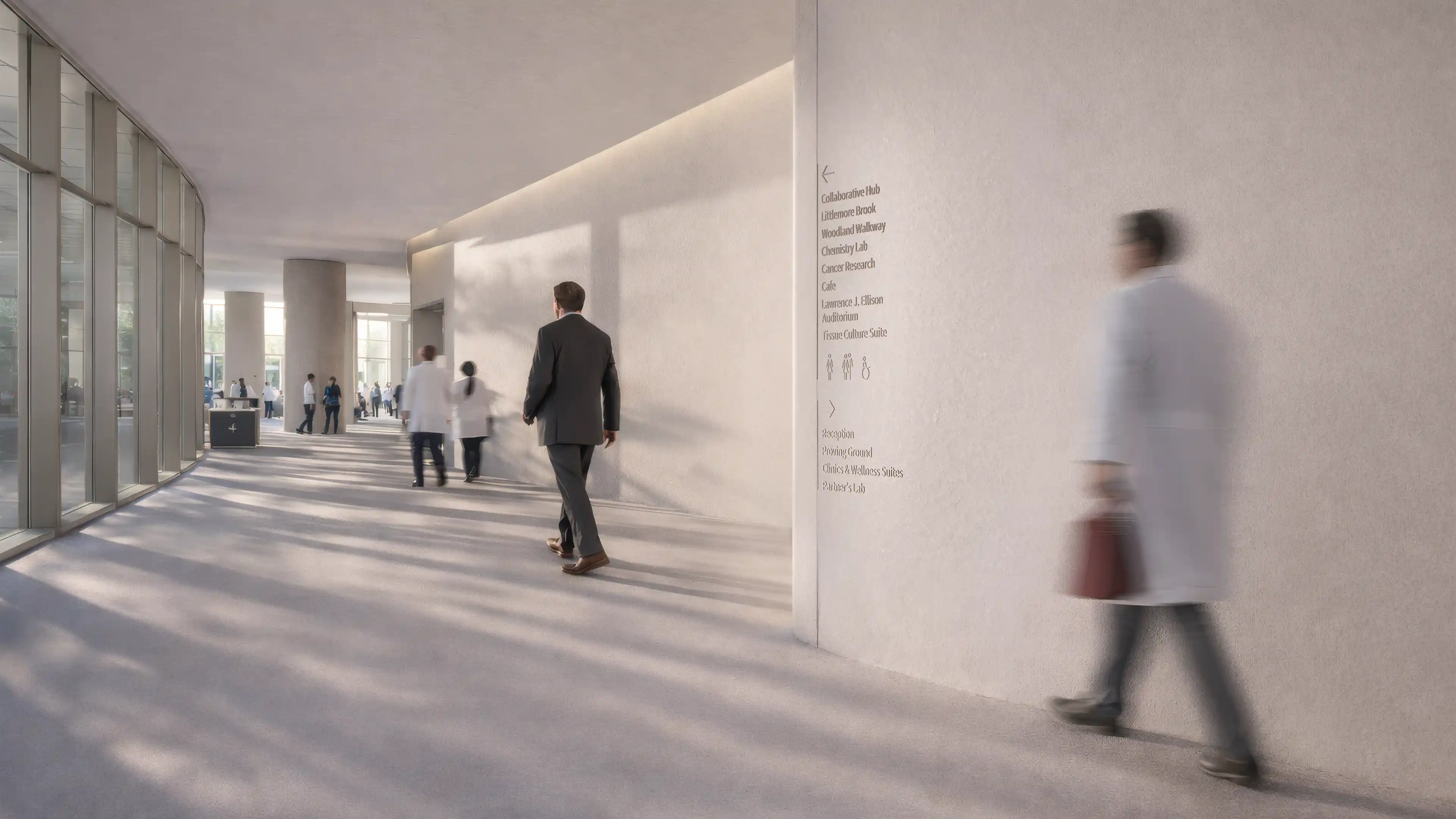
The building will not be used that way. A patient may arrive anxious and late for an appointment. A passenger may be watching the clock while looking for a changed gate. A parent may be guiding children through a crowded mixed-use development while trying to find a car park entrance they have never used. These are not unusual failures of user behaviour. They are normal conditions of use.
Wayfinding under pressure is therefore not a specialist concern limited to hospitals or airports. It is a way of testing whether a place remains understandable when the user cannot give it full attention. Pressure removes the patience that weak environments quietly depend on.
Across more than 600 projects in 37 countries, we have seen the same pattern in very different sectors. Confusion rarely begins with the graphic design of a sign. It begins earlier, when the environment requires more interpretation than the user can reasonably provide at that moment.
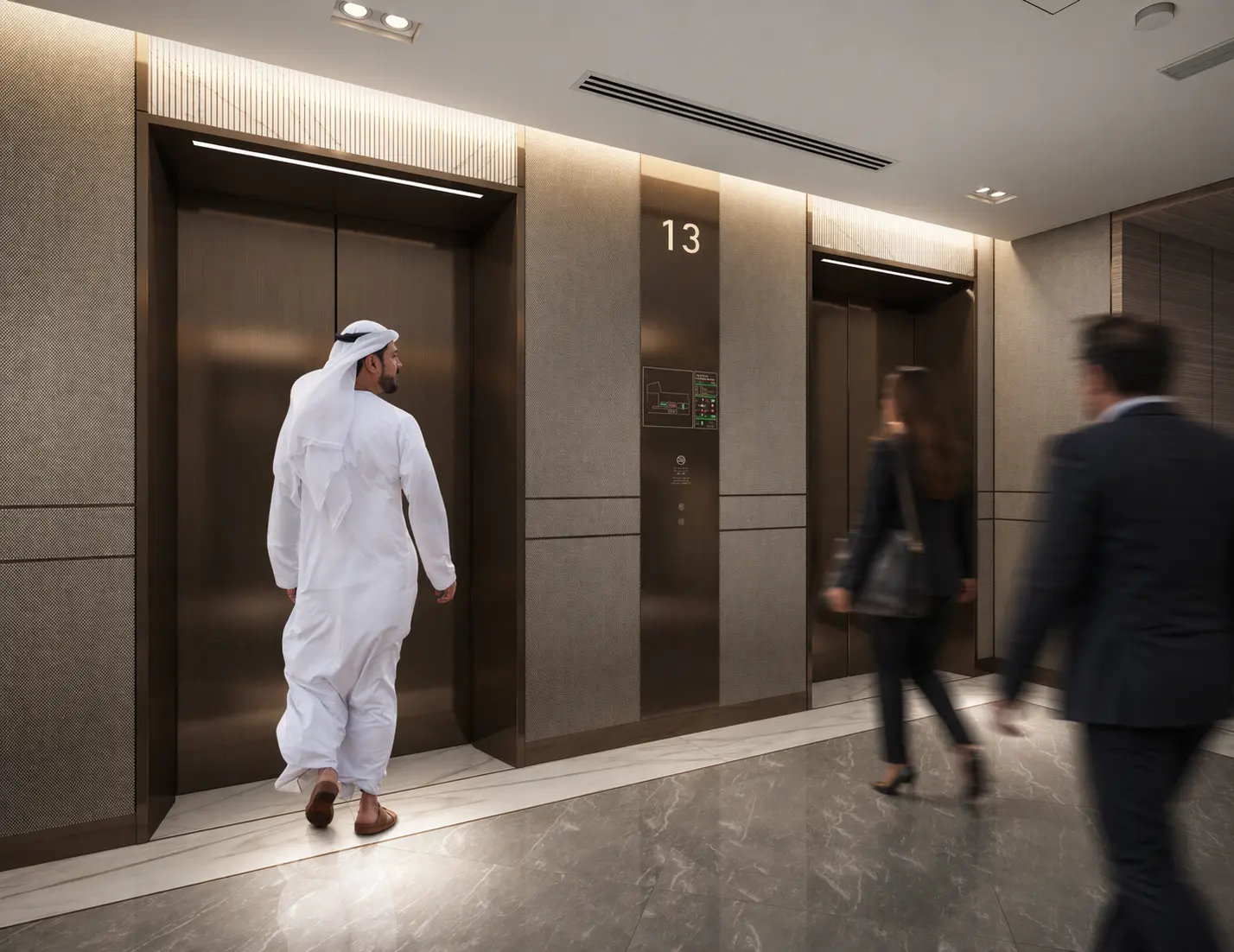
Calm conditions hide how the place really performs
A design team normally experiences a project with knowledge that ordinary users do not have. They know which entrance is primary, which lift serves which destination and why one department has a different name from another. That familiarity fills gaps in the environment. It can make an unclear route feel obvious because the reviewer already knows the answer.
Pressure removes this advantage. The user has less time to compare options, less confidence that a choice is correct and less willingness to stop and study the environment. A weak route becomes visible through hesitation, backtracking, sudden changes of direction and repeated requests for help.
This is why a successful drawing review is not proof of a successful journey. The plan may show that every destination can be reached and every decision has a sign. It does not show whether an unfamiliar person can recognise the entrance, find the first cue, understand the terminology and maintain confidence from one decision to the next.
The more serious question is not whether the system works when users are calm. It is whether it still works when calm cannot be assumed.
Pressure changes the usable environment
Stress is not a single, predictable state, and people respond to it differently. It would be careless to claim that every anxious or hurried person behaves in the same way. What the evidence does support is more useful: acute stress can impair working memory and cognitive flexibility, while time pressure and divided attention reduce the capacity available for complex decisions.
For wayfinding, that matters because many systems depend on precisely those capacities. They ask users to remember a sequence of directions, compare several destinations, interpret an unfamiliar map, translate between different names or recover information seen earlier in the journey.
Under pressure, the usable environment becomes smaller. Information that is technically present may not be noticed. A destination included in a dense list may not be found quickly enough. A direction given three decisions earlier may no longer be reliable. A subtle visual cue may work for the design team and disappear for the person focused on an immediate concern.
The problem is not that the user has failed to pay attention. The system has assumed a level of attention that the situation does not allow.
Pressure exposes weaknesses that already exist
Stress does not turn a clear building into a confusing one. It magnifies uncertainty already built into the journey. A hidden entrance remains hidden. Competing corridors still appear equally important. An inconsistent destination name still forces translation. A sign placed after the point of choice still arrives too late.
In calm conditions, users may compensate. They stop, compare information, ask someone or retrace their route. Under urgency, those recovery behaviours become more costly. A small ambiguity can produce a wrong turn, and the wrong turn can create a second layer of uncertainty because the user no longer knows where the original route was lost.
This distinction is important for clients. If pressure is treated as the cause, the response is often to add larger or more frequent signs. If pressure is treated as a test, the team looks deeper. It asks whether the entrance hierarchy is clear, whether routes are visually legible, whether destination names are stable, whether information appears before the decision and whether progress is confirmed afterwards.
The objective is not to design a more forceful graphic layer. It is to remove avoidable uncertainty from the complete system.
The environment should carry more of the cognitive load
A place is easier to navigate when its organisation can be understood without constant explanation. Primary routes should feel primary. Entrances should look like entrances. Important destinations should have an understandable relationship to arrival points, lift cores, public spaces and one another.
Architecture, lighting, landscape, material changes, public art and visible activity can all support orientation. A memorable atrium, a distinctive artwork or a clear view to a lift core can provide recognition that requires less reading and is easier to retain than a sequence of room numbers. These cues are valuable only when they are positioned and described as part of the navigation logic. Decoration alone does not create a useful landmark.
Information then supports the structure the user can already sense. It identifies choices, confirms direction and resolves uncertainty at the right moment. This is different from using signs to explain a place whose spatial hierarchy remains unclear.
When the environment carries more of the navigational burden, users are not required to build a complete mental model before they can move. They can make one clear decision, receive confirmation and continue. That sequence is more resilient because it does not depend on remembering the entire journey at once.
More information can reduce confidence
Projects often respond to uncertainty by adding content. More destinations are placed on each sign. More signs are added at each junction. Maps become denser in an effort to appear comprehensive. The result may contain every answer and still make the immediate decision harder.
Under pressure, the user is not asking for all available information. They are asking what to do next. A sign that presents twelve choices when only three are relevant transfers the work of prioritisation to the person least prepared to do it.
Reassurance also requires continuity. The message must appear before the decision, remain consistent through the route and be confirmed after the user commits. When a destination disappears from one sign, changes name on another or is represented differently in a digital channel, uncertainty returns even if each individual element is well designed.
The strongest systems are selective. They distinguish between information that supports the current decision and information that can wait. Clarity is not achieved by saying less everywhere. It is achieved by saying the necessary thing at the necessary moment.
Pressure is different in every sector
Healthcare
In healthcare, pressure may be emotional before the journey begins. Patients and visitors can be worried, physically uncomfortable, unfamiliar with clinical terminology or focused on someone else. The route may cross several buildings, levels and departments, while appointment information uses names that do not match what appears on site.
The wayfinding response should not assume that a comprehensive directory solves this condition. Arrival, entrance recognition, destination naming, route continuity, accessible movement and staff communication must work together. When they do not, staff become the recovery system and clinical operations absorb the interruption.
Airports and transport environments
In airports and transport environments, the pressure is often driven by time, consequence and changing information. Passengers move through a chain of decisions from roadway or station to terminal, processing, gate and onward connection. A broken link can become more serious because the user is moving against a fixed departure time.
These environments also demonstrate why continuity matters across organisations. Airport, airline, security, retail and transport information may be controlled by different parties. The passenger experiences one journey. Any inconsistency between those systems becomes their problem to solve.
Mixed-use developments, cities and major venues
Pressure in mixed-use developments, cities and major venues may be less obvious, but it is persistent. People arrive by different modes, entrances change by time of day, destinations carry commercial and local names, and temporary events alter familiar routes. Crowds can obscure sightlines and encourage people to follow movement even when it leads away from their destination.
The system needs stable anchors, clear district or zone logic and a way to communicate change without replacing the underlying structure. If temporary information creates a second navigation system, the environment becomes harder to understand precisely when demand is highest.
A robust system makes recovery possible
Wayfinding is often designed as if every user will notice every cue and make every decision correctly. Real journeys are interrupted. People enter through the wrong door, miss a sign, follow another person, receive outdated verbal directions or change destination halfway through the route.
Recovery should therefore be treated as part of the system, not evidence that the system has failed. Users need recognisable places where they can regain orientation, confirmation that reveals when they are no longer on the intended path and information that reconnects them without requiring a return to the beginning.
This can be supported by repeated destination names, visible landmarks, clear zone boundaries, floor identification, consistent maps and staff who use the same route language as the physical and digital system. The specific tools vary, but the principle is constant: a wrong decision should not cause the rest of the journey to collapse.
Designing for recovery also improves resilience when operations change. A closed entrance, diverted corridor or relocated department is easier to communicate when the permanent system has a clear hierarchy. Temporary information can then modify a known structure rather than attempt to explain the entire place again.
Confusion becomes an operational cost
A navigation failure may look minor when viewed as one person asking for directions. Across a busy asset, the same uncertainty repeated throughout the day becomes operational work. Reception, security, clinical, retail and facilities teams spend time correcting journeys that the environment should have supported.
Hesitation can also affect flow. People stop at the top of escalators, gather around directories, reverse direction in narrow routes or queue at help points. In time-sensitive environments, lateness carries further consequences. In commercial environments, frustration can shorten visits and weaken confidence in the asset.
These effects are often dispersed across departments, which makes them easy to underestimate. The wayfinding budget is visible as a project cost. The operational burden of confusion is distributed through staffing, complaints, temporary signs, repeated updates and lost time.
The commercial case for stronger wayfinding is therefore not based on claiming that every error can be eliminated. It is based on reducing avoidable uncertainty before it becomes a recurring demand on people and operations.
Testing must include the moments that matter
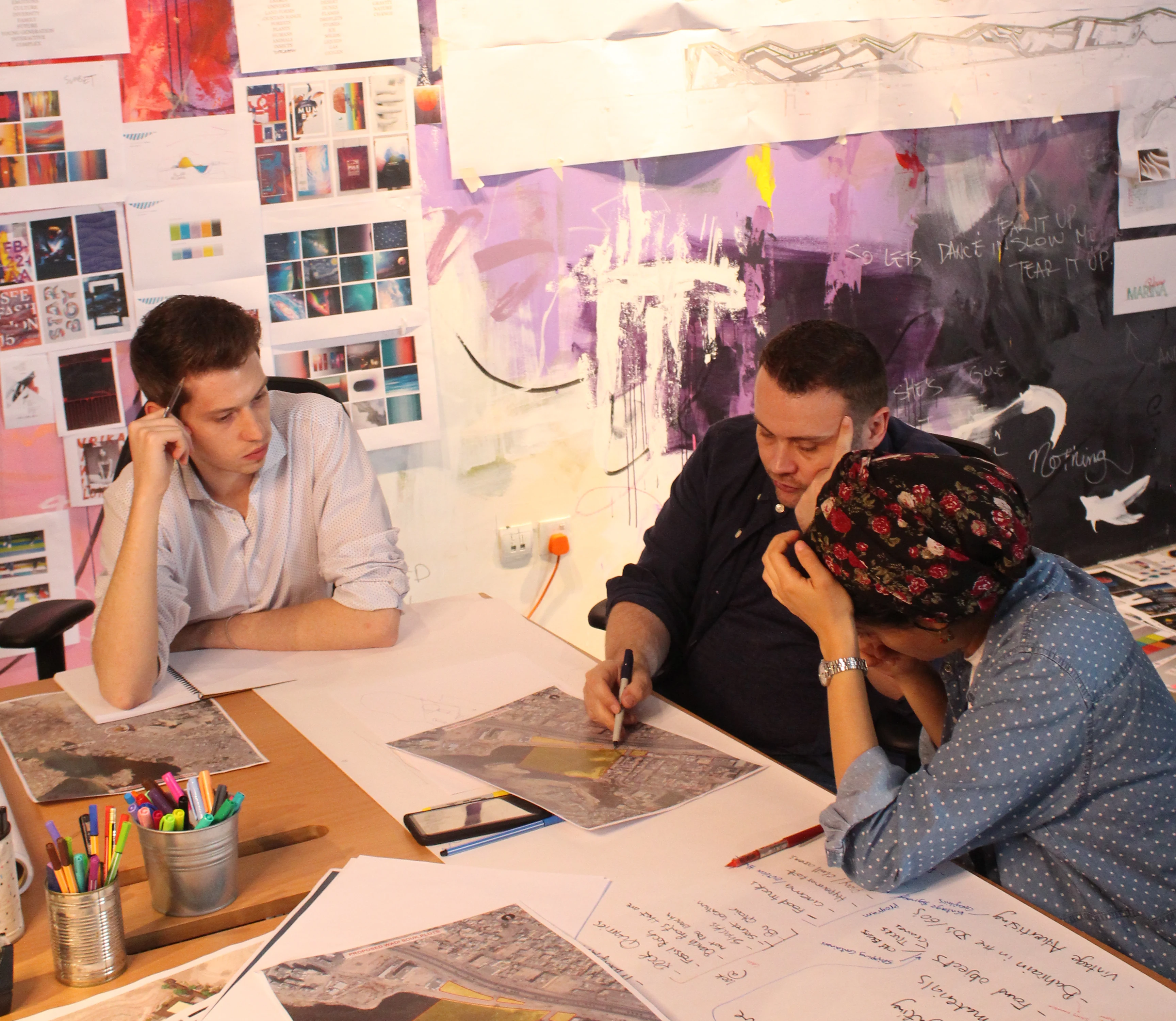
A wayfinding review should test journeys, not isolated signs. It should begin from realistic origins, include the full information chain and observe what happens at the points where users must choose, confirm or recover.
The most useful testing uses people who do not already understand the project. They should be given realistic destinations and only the information an ordinary visitor would receive. The review should look for hesitation, missed cues, incorrect assumptions, backtracking and reliance on staff rather than asking only whether the signage can be read.
Pressure does not need to be manufactured carelessly. The team can test difficult conditions through scenario planning: an unfamiliar first visit, a changed gate, a late appointment, a closed entrance, a crowded event, a user switching from a digital instruction to physical information or a route that requires an accessible alternative.
Mock-ups and site trials are particularly valuable because they reveal sightline obstructions, competing messages, viewing distances and environmental conditions that are difficult to judge on drawings. After opening, observation and staff feedback can show where the same problems recur.
Testing should not be used to prove that the design is finished. It should be used to find where confidence breaks before the user pays the cost.
Design for the least forgiving moment
The highest standard for a wayfinding system is not that an informed reviewer can explain it. It is that an unfamiliar person can continue moving when they are distracted, hurried or uncertain.
That outcome depends on the complete environment. Spatial planning establishes the route. Architecture and environmental cues make the structure legible. Naming and information architecture make destinations understandable. Signs, maps, digital tools and staff communication deliver consistent guidance. Testing reveals where the chain breaks.
LIMAH approaches Wayfinding & Navigation as part of Built Environment Experience Design because people do not experience these elements as separate consultant packages. They experience one place and one journey. When the parts conflict, the user carries the burden. When they are aligned, movement feels clear even when the situation is not.
Pressure is useful because it strips away assumptions. It shows whether the place is genuinely understandable or merely explainable. The strongest environments do not demand calm, perfect attention or prior knowledge. They continue to guide people through the moment that is least forgiving.