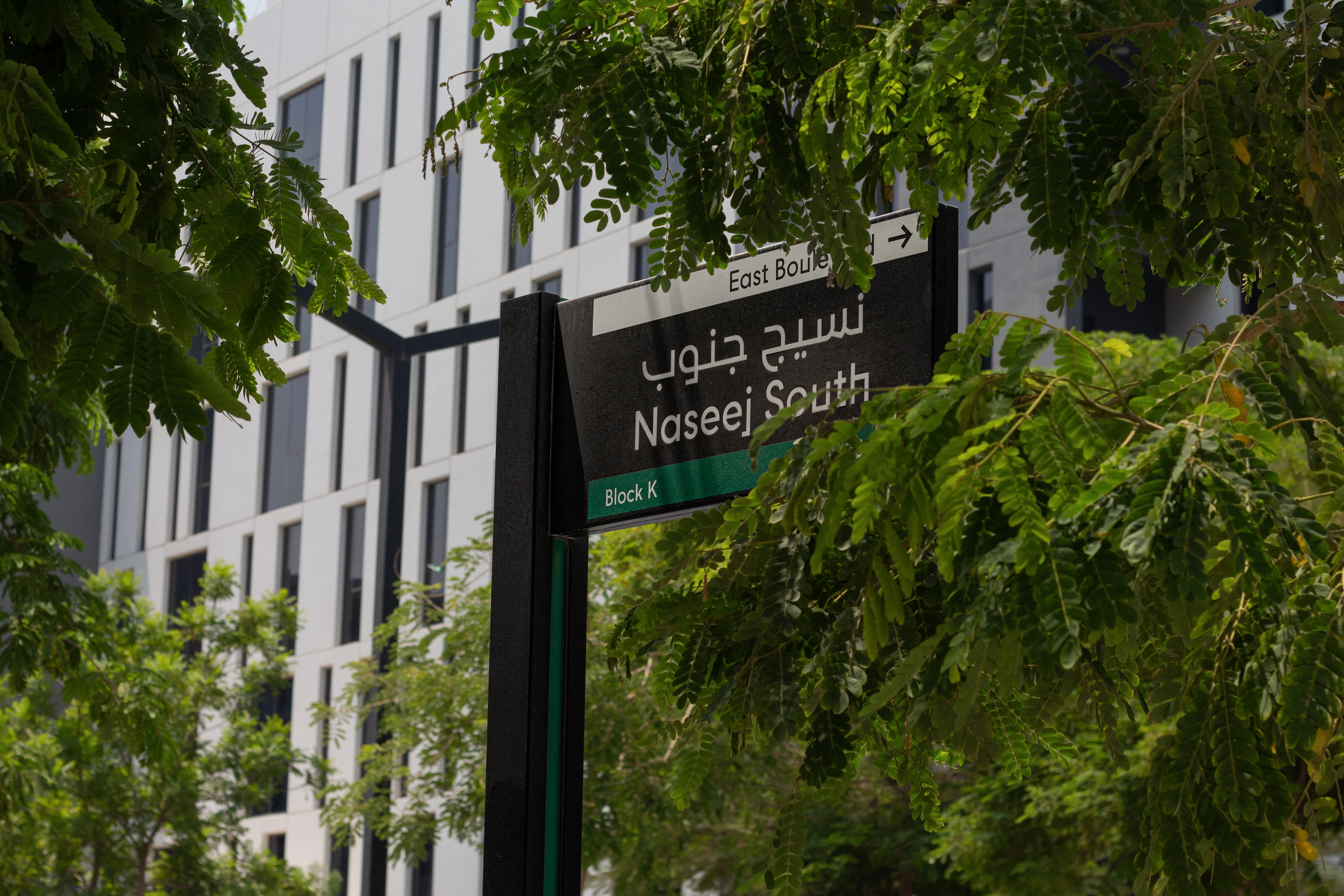



The logic seems reasonable. People are getting lost, so give them more directions. A difficult junction receives another arrow. An unclear entrance gets another identifier. A confusing lift lobby gains a directory. Temporary notices appear beside permanent ones. Before long, the building is communicating more than ever, yet people are not necessarily understanding it any better.
The problem is that confusion is not always an information problem.
It can begin with the position of an entrance, the organisation of circulation, poor sightlines, inconsistent destination names, indistinguishable spaces or a decision that asks people to understand too much at once. It can come from architecture, planning, operations or the way several systems have been coordinated.
A physical sign can communicate information. It cannot repair the spatial logic around it. That distinction matters because signage is often asked to solve problems that should have been addressed much earlier through Wayfinding & Navigation.

People navigate places, not signs
A person entering an unfamiliar building does not experience architecture, interiors, operations, digital information and physical signs as separate professional packages. They experience one place.
They look for an entrance. They form an impression of how the building is organised. They notice open routes, landmarks, thresholds, people and activity. They interpret names and symbols. They make a decision, move, check whether the decision appears correct and then make another.
Signs can support this process, but they are only one source of information.
The position of a doorway communicates something. So does the width of a route, the visibility of a staircase, the character of a lobby, the location of a reception desk and the ability to see a destination from a decision point. Architecture is already communicating before a sign is added.
This is why Wayfinding & Navigation has to be understood as a user-experience discipline rather than a signage exercise. Its job is to help people understand where they are, where they need to go and what decision to make next. Physical signage is one communication layer within that wider system.
When the environment already makes sense, signs can reinforce its logic. When the environment contradicts that logic, signs are forced to explain the contradiction.

A sign cannot make the wrong route intuitive
Imagine a visitor arrives at a building and the entrance they need is not visible from the natural approach. A sign may point towards it, but the person still has to override what the environment appears to be telling them.
Or consider a major destination reached through a secondary-looking corridor while a visually dominant route leads somewhere else. An arrow can give the correct instruction. The architecture continues to suggest the opposite.
These are not necessarily signage failures. They are conflicts between environmental expectation and required movement.
Every time a person must choose between what the place appears to say and what a sign tells them to do, the navigation system asks for additional attention. One contradiction may be manageable. Repeated contradictions create hesitation and reduce confidence.
The stronger response is to identify these conflicts while routes, entrances, thresholds and circulation can still be influenced.
This does not mean every building can be made self-explanatory. Complex places need information. Hospitals have many destinations. Airports have changing operational conditions. Mixed-use developments combine different user groups, access rules and modes of movement. Signage can be essential in these environments.
But essential is not the same as sufficient.
More information can become part of the problem
When confusion appears late in a project, adding information is often easier than changing the environment. This creates a familiar pattern: every reported problem generates another message.
A sign is added for the car park. Another explains which lift to use. Another identifies an entrance. Another corrects a misunderstanding at reception. Another is introduced because the previous instruction was missed. Each addition may make sense when considered individually. Collectively, the system can become harder to read.
People have limited attention. At a decision point, they need the information relevant to the decision they are making at that moment. Giving them every possible destination, qualification and instruction does not necessarily make the choice clearer.
Over-signing is therefore not simply a visual problem. It can be evidence that the wider navigation system has not established a strong hierarchy. Good Wayfinding & Navigation asks a different question. Instead of asking, “What else can we tell people here?”, it asks, “What does the person need to understand at this point, and why is that not already clear?”
Sometimes the answer is a sign. Sometimes it is a change to naming, visibility, route hierarchy, architectural differentiation, operational procedure or the sequence in which information is provided.

Late-stage signage inherits earlier decisions
Physical signage is often developed after many of the decisions that determine navigation have already been made.
Entrances may be fixed. Circulation cores are located. Walls are built. Tenancies are allocated. Destination names have emerged from different teams. Security arrangements affect routes. Digital platforms may already use their own terminology. At that point, the signage system inherits the consequences. A sign location cannot create a sightline that architecture has removed. An arrow cannot simplify an unnecessarily complicated route. A directory cannot reconcile several competing naming systems unless the project first agrees what destinations are actually called.
Even the physical opportunity to communicate may have been compromised. The useful location for information may be occupied, poorly illuminated, visually cluttered or positioned too late for the decision a visitor needs to make. This is one reason Wayfinding & Navigation should begin before the signage design package.
Early work is less concerned with the appearance of signs and more concerned with the logic those signs will eventually need to communicate. It examines users, journeys, destinations, arrival points, movement hierarchies, decision points, naming, information requirements and the relationship between physical and digital guidance.
That work can expose problems while the project still has choices.
Decision points reveal whether the building is doing enough
One of the most useful ways to understand a navigation problem is to examine the environment from the point at which a person actually has to decide.
Plans can make routes appear obvious because the viewer sees the whole building from above. Users do not have that privilege. They see what is available from their position. At a junction, can they distinguish the available routes? Is the destination terminology already familiar? Is the next important landmark visible? Does the architecture reinforce the intended direction? Is information provided before the choice has to be made? After turning, is there enough confirmation to know the decision was correct?
These questions move the discussion beyond whether a sign exists. A technically correct arrow placed after the junction is of little help. A beautifully designed directory containing unfamiliar destination names can still create uncertainty. A prominent sign competing with several other messages may not function as prominent information at all.
Wayfinding performance depends on the relationship between information, environment and behaviour at the moment of decision.
That relationship needs to be designed.

Confusing buildings create operational workarounds
When a place does not explain itself clearly, people look for another source of help. They ask receptionists. They stop security staff. They follow other visitors. They call the person they are meeting. Operators introduce temporary notices. Staff develop informal explanations for recurring problems. These behaviours are useful because they reveal where the designed experience is failing.
A receptionist repeatedly giving the same direction may indicate more than a customer-service requirement. It may reveal a weak arrival sequence, an unclear destination hierarchy or a decision point that does not provide enough information. The danger is that these workarounds become normal. Once staff intervention, temporary notices and additional signs are accepted as part of everyday operation, the underlying design problem becomes less visible. The building appears to function because people have learned how to compensate for it.
For an owner or operator, that distinction matters. A workaround still consumes attention, staff time, maintenance effort and management capacity. It can also make the experience inconsistent because success depends on who is available to help. The objective should not be to eliminate every request for assistance. Human support is valuable and sometimes essential. The objective is to avoid making human intervention the default navigation system for problems the environment could have resolved.

The best signage system may need fewer signs
This can sound contradictory coming from a consultancy that designs physical signage systems, but a strong system should not be judged by how many signs it contains. It should be judged by whether people receive the right information in the right place, at the right time, as part of an environment they can understand.
That can mean removing signs as well as adding them. If architectural differentiation makes two routes easier to distinguish, less explanation may be needed. If destination names are simplified and consistently applied, directories can become clearer. If an entrance becomes visible from the natural approach, layers of reassurance may no longer be necessary. If information is sequenced according to the journey, users do not have to process the whole building at every junction.
This is where signage design becomes more valuable, not less. Once the spatial and informational logic is established, physical signs can perform the job they are suited to doing: identifying, directing, confirming, informing and regulating where explicit communication is required. They stop being patches for unresolved design decisions.
Wayfinding needs a seat at the table before the signs do
The timing of Wayfinding & Navigation changes what it can influence. Introduced early, it can test how people will arrive, understand the place, distinguish destinations and move between them. It can identify where architecture and expected behaviour are in conflict. It can establish naming and information principles before separate teams create competing versions. It can protect important sightlines and decision points as the design develops.
Introduced late, the same discipline may be restricted to explaining conditions it did not help shape. There will always be constraints. Existing buildings cannot simply be replanned. Operational requirements change. Complex assets evolve. In those circumstances, carefully designed signage, digital guidance, staff communication and other interventions can materially improve navigation.
The point is not that signage is ineffective. The point is that its effectiveness depends on the system around it.
Treating signs as the first response to confusion reverses the order of the problem. The first task is to understand why people are becoming uncertain. Only then can the project decide which combination of spatial, informational, operational, digital and physical interventions is appropriate.
Fix the logic before adding another instruction
When a building is difficult to navigate, another sign may be exactly what is required. But it should be the result of diagnosis, not the substitute for it. The more useful questions begin earlier.
Is the intended route understandable? Are entrances and destinations organised clearly? Do names remain consistent throughout the journey? Are decisions being presented in a sequence people can process? Does the architecture support the movement the project expects? Are digital, operational and physical communication layers reinforcing the same logic? If those foundations are weak, signage is being asked to carry a burden it was never designed to carry.
Wayfinding & Navigation starts with the human journey because that is where confusion actually occurs. It looks at the relationship between people, space, information and operation before deciding what physical communication is needed. A good sign can help someone make the right decision. A good wayfinding system makes sure the building is not continually asking signs to explain why it is confusing.