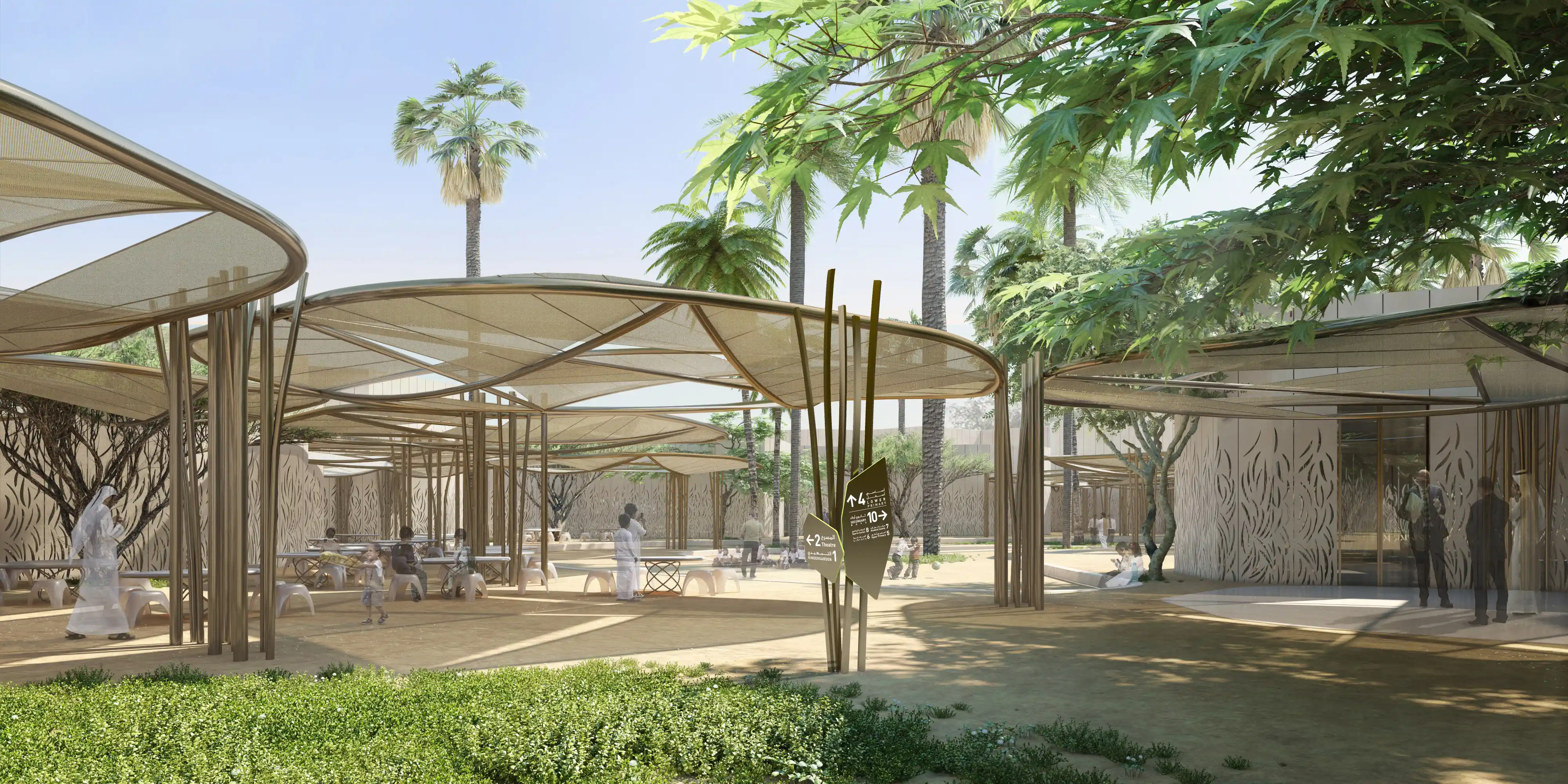

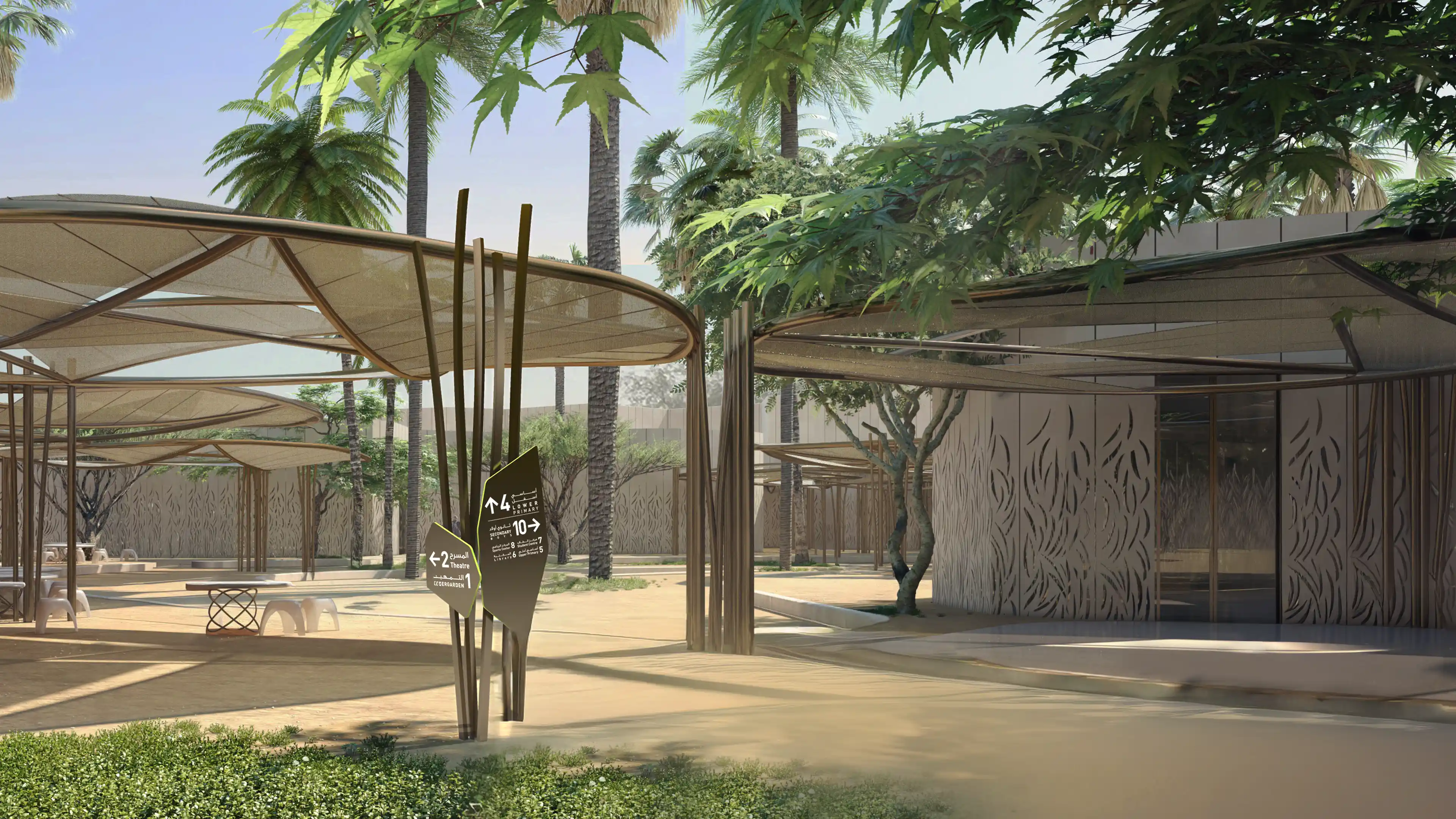
Pedestrian Directional Signage at Dar Al Marefa in Dubai, designed by LIMAH
Project
/

Dar Al Marefa

Dubai, UAE

Dar Al Marefa
2018
Project
/

Dar Al Marefa

Dubai, UAE

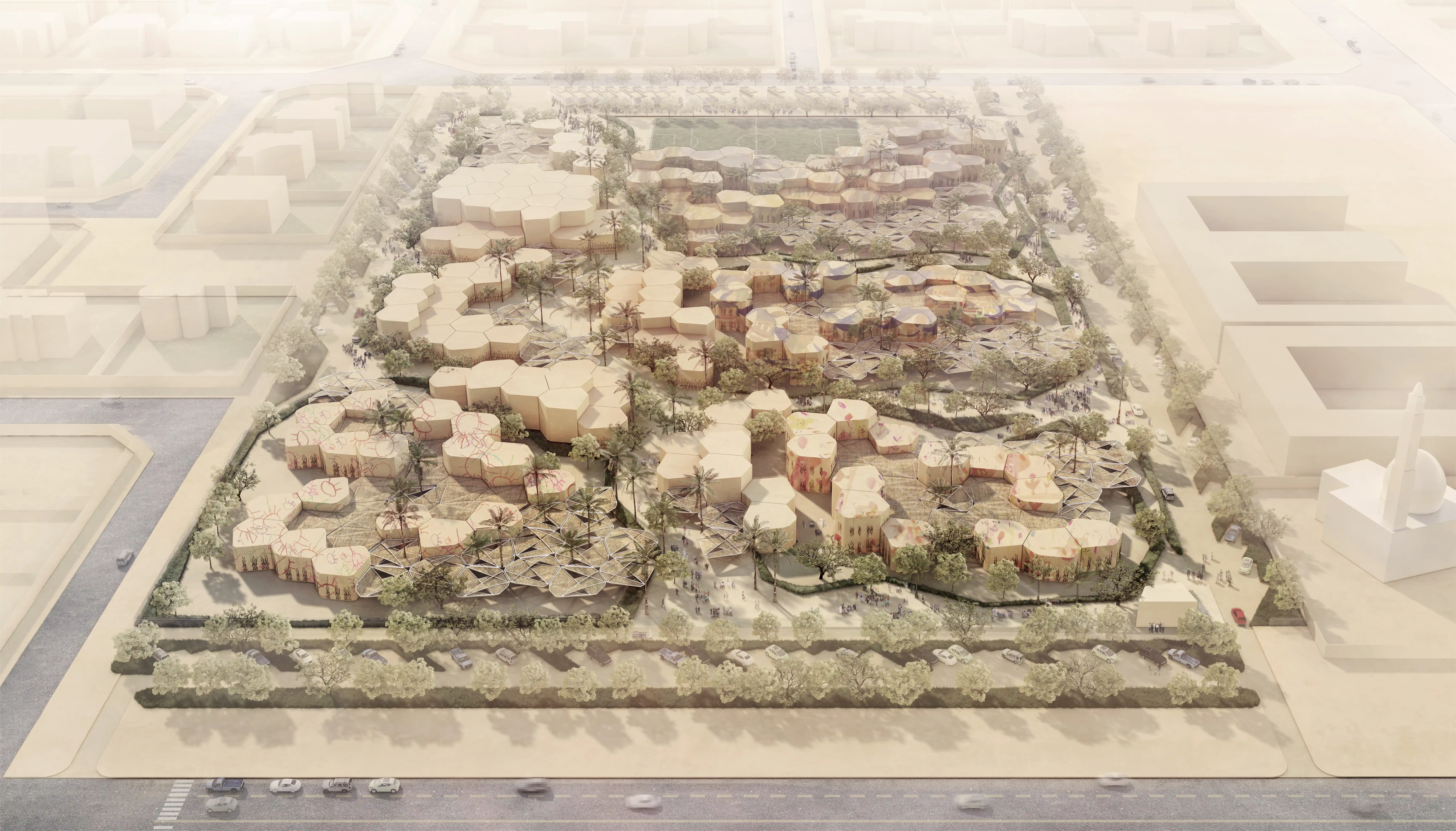
Located in Dubai within the Al Khawaneej district, Dar Al Marefa is a bilingual IB curriculum school designed to support learning through clarity, structure, and community. The campus brings together multiple buildings, age groups, and user types, including students, teachers, parents, staff, and visitors within a dynamic educational environment that balances academic focus with everyday ease of movement.

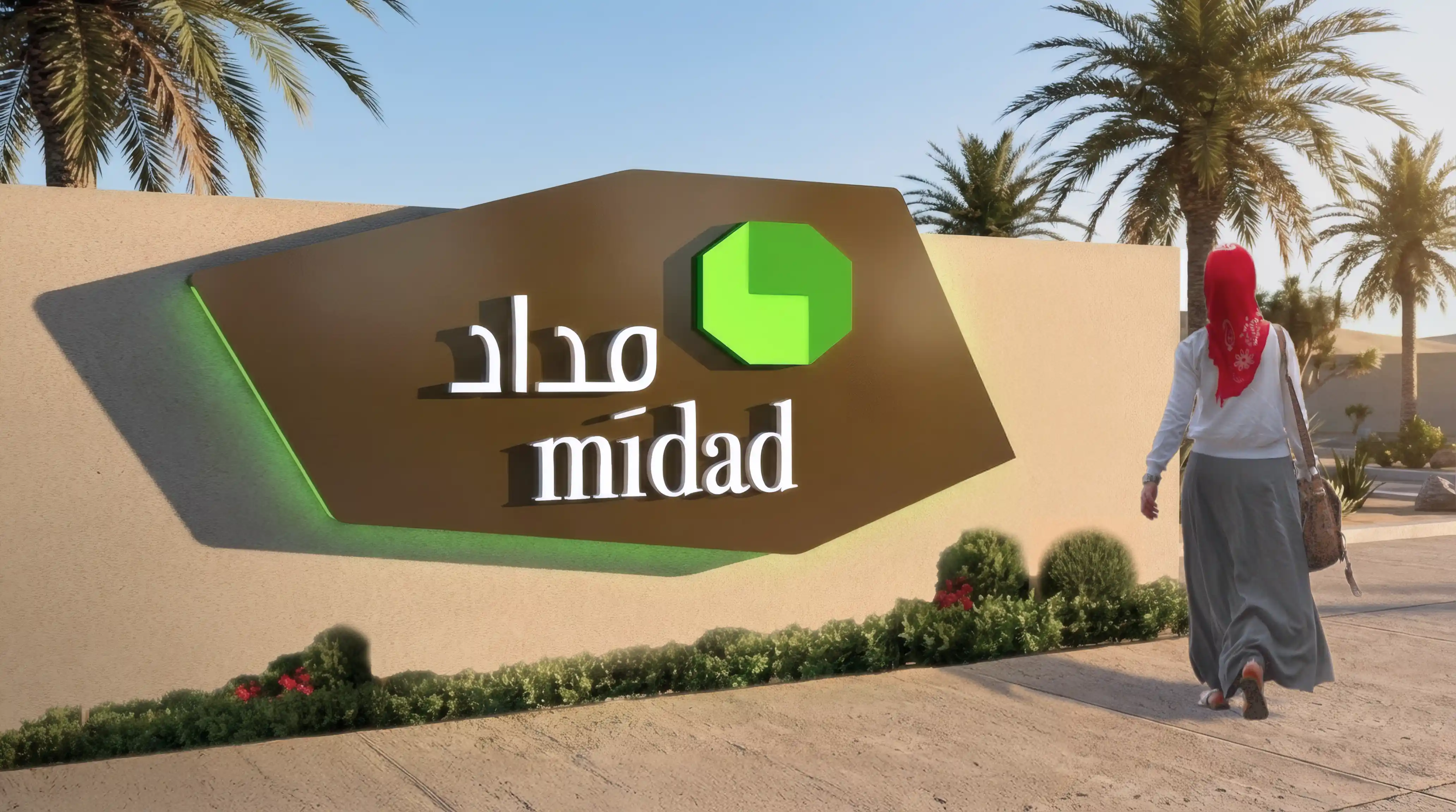
Working in collaboration with Muraba, we developed a comprehensive wayfinding and signage strategy across interior, exterior, parking, and back-of-house environments. The project focused on creating intuitive navigation systems that reinforce the school’s identity while supporting confidence, independence, and accessibility from first arrival.

Our approach combined zoning, colour, numbering, and expressive graphic systems to create an environment that feels welcoming, legible, and engaging for users of all ages.

‍

STRATEGIC DRIVERS

  • Supporting intuitive movement across a multi-building educational campus
  • Creating clear orientation systems for students, parents, visitors, and staff
  • Establishing distinct building identities through colour, naming, and numbering
  • Integrating playful visual language without compromising legibility
  • Reinforcing the school’s identity through cohesive environmental graphics and signage
EXPERIENCE STRATEGY AND DESIGN

CAMPUS MOVEMENT

We began by studying how people move through the campus on a daily basis. Arrival sequences, pedestrian routes, drop-off zones, and internal circulation paths were carefully mapped to identify key decision points, areas of hesitation, and moments where reassurance or additional clarity may be required.

These movement studies became an important coordination tool across the wider design team, helping identify both opportunities and constraints throughout the site. Rather than relying solely on signage placement, the strategy focused on understanding movement behaviours and creating a system that supports navigation naturally through the built environment.

‍

ZONING STRATEGY

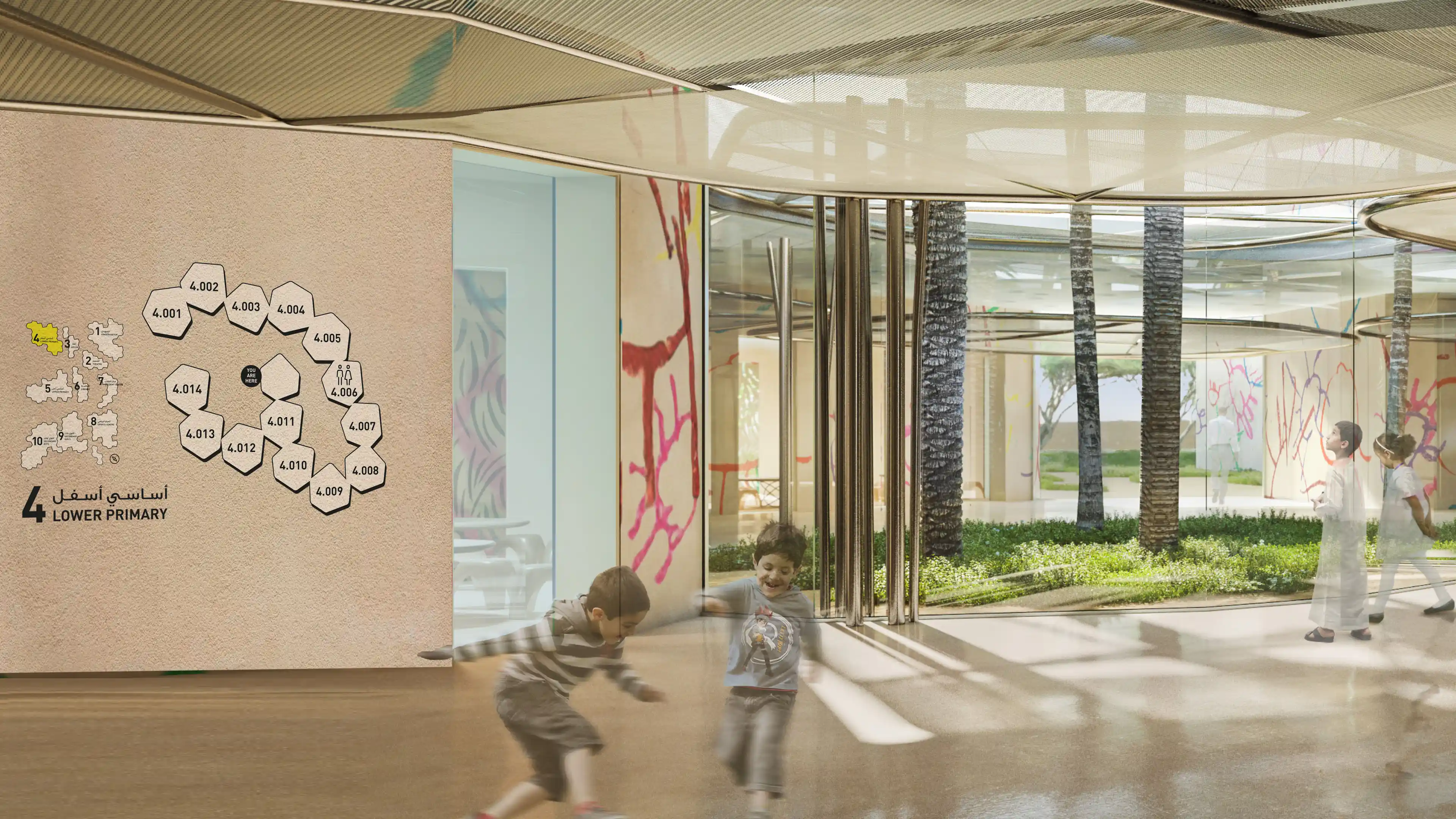
The campus was organised into a series of clearly defined zones based on function, destination, and building identity. Each building was assigned a unique combination of naming, numbering, and colour, allowing users to understand the campus as a connected collection of recognisable places.

Building names were intentionally designed to remain flexible, allowing the school to adopt playful or age-appropriate terminology aligned with its wider identity. Numbering systems provided a clear organisational framework that informed room identification, maps, and navigational signage across the site.

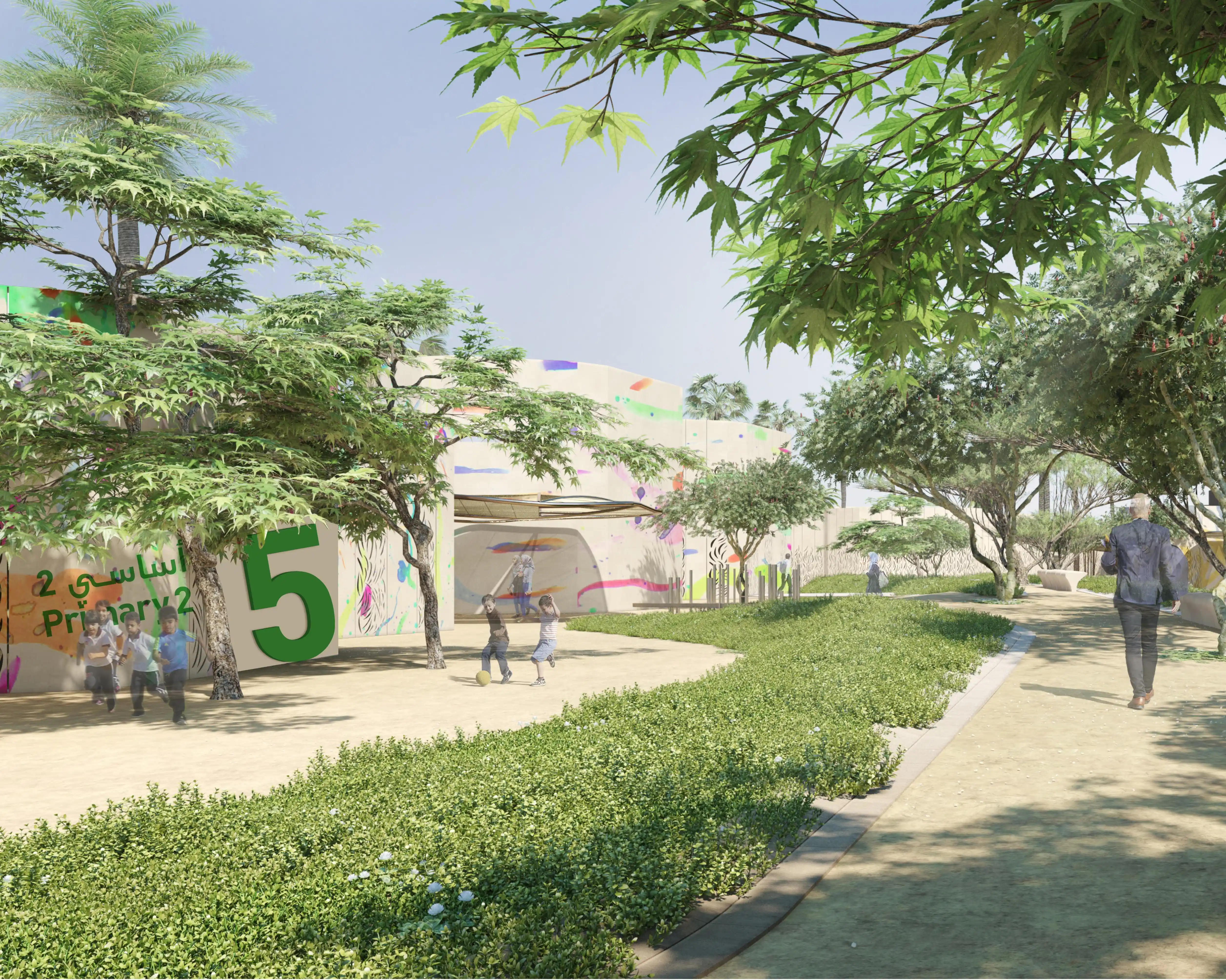
Colour became a central navigational tool throughout the campus. Each building adopted a distinct colour drawn from the school’s broader identity palette, applied consistently across signage, maps, and architectural touchpoints to support rapid orientation, particularly for younger students and first-time visitors.

‍

DESIGNING A PLAYFUL VISUAL LANGUAGE

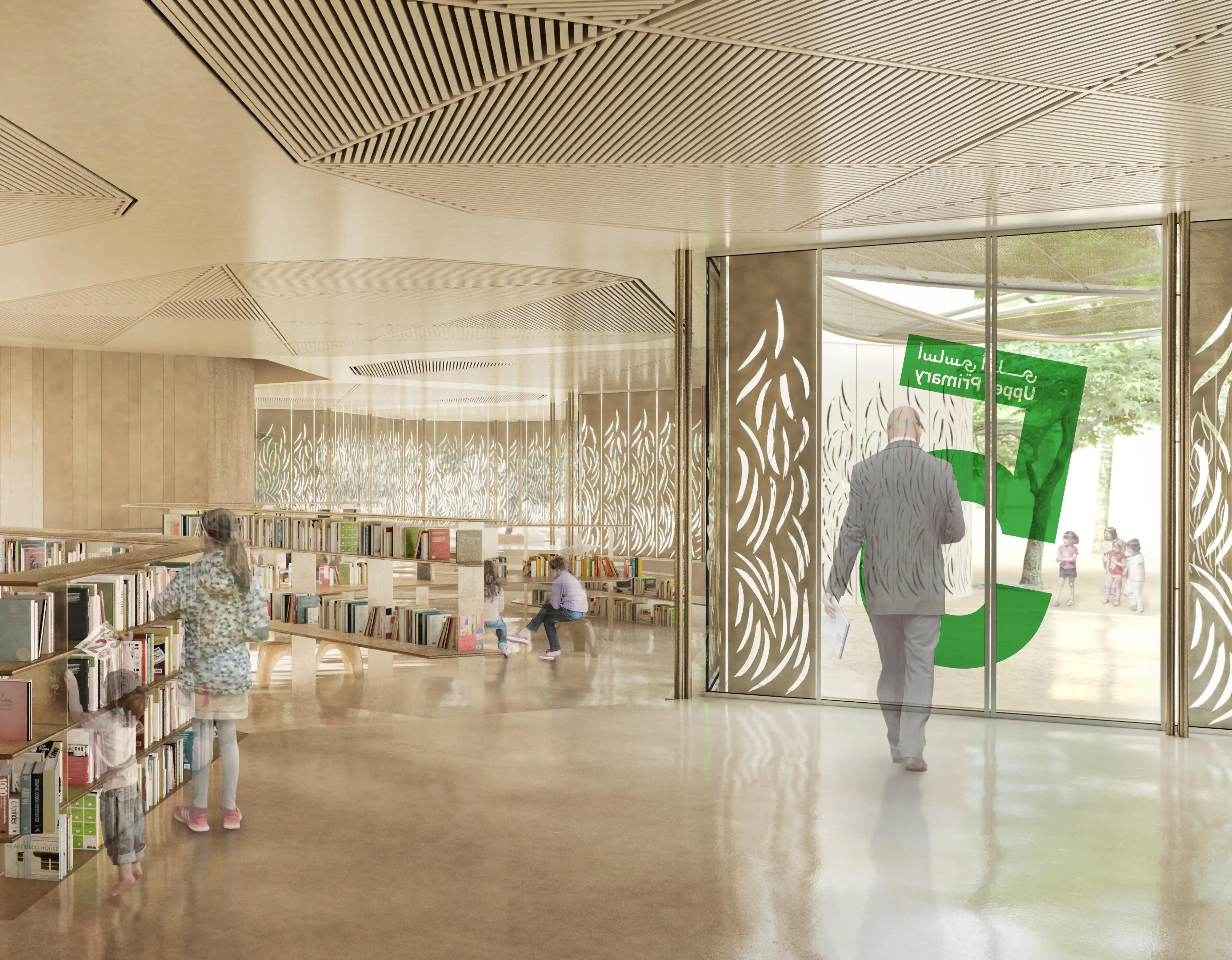
The visual identity for the wayfinding system was intentionally expressive and energetic in response to the educational environment. Signage elements use stacked compositions of text, arrows, numbers, and pictograms to create a graphic language that feels engaging and accessible while maintaining clarity and legibility.

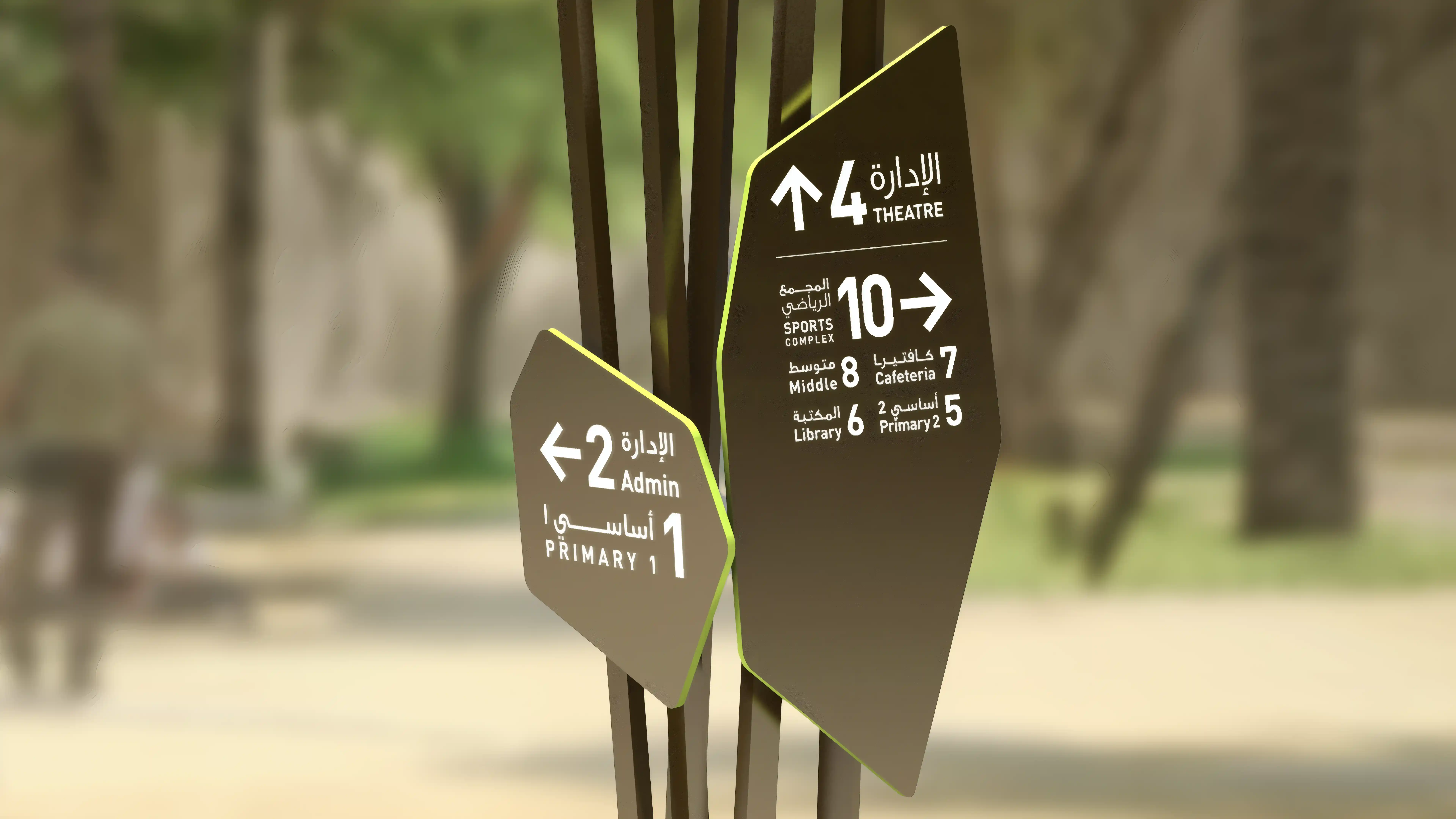
Pedestrian directional signage draws inspiration from the structural shading elements within the campus architecture. Messages are distributed across multiple angled surfaces that improve visibility while reinforcing the geometry and rhythm of the built environment.

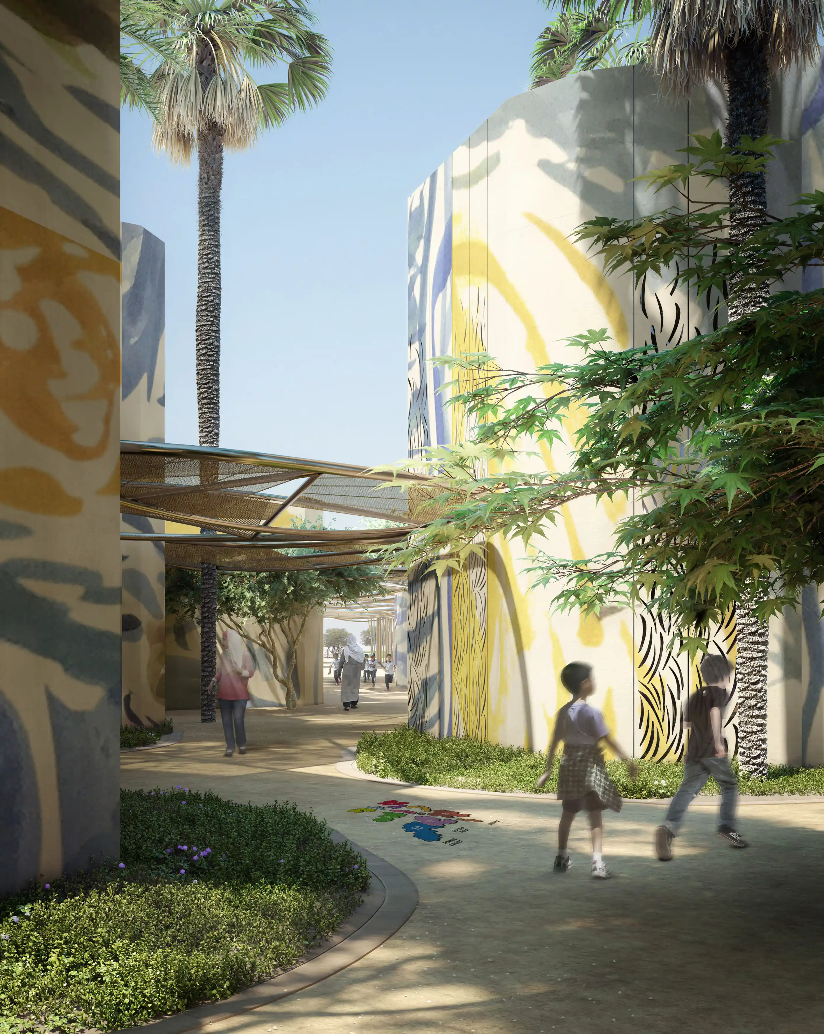
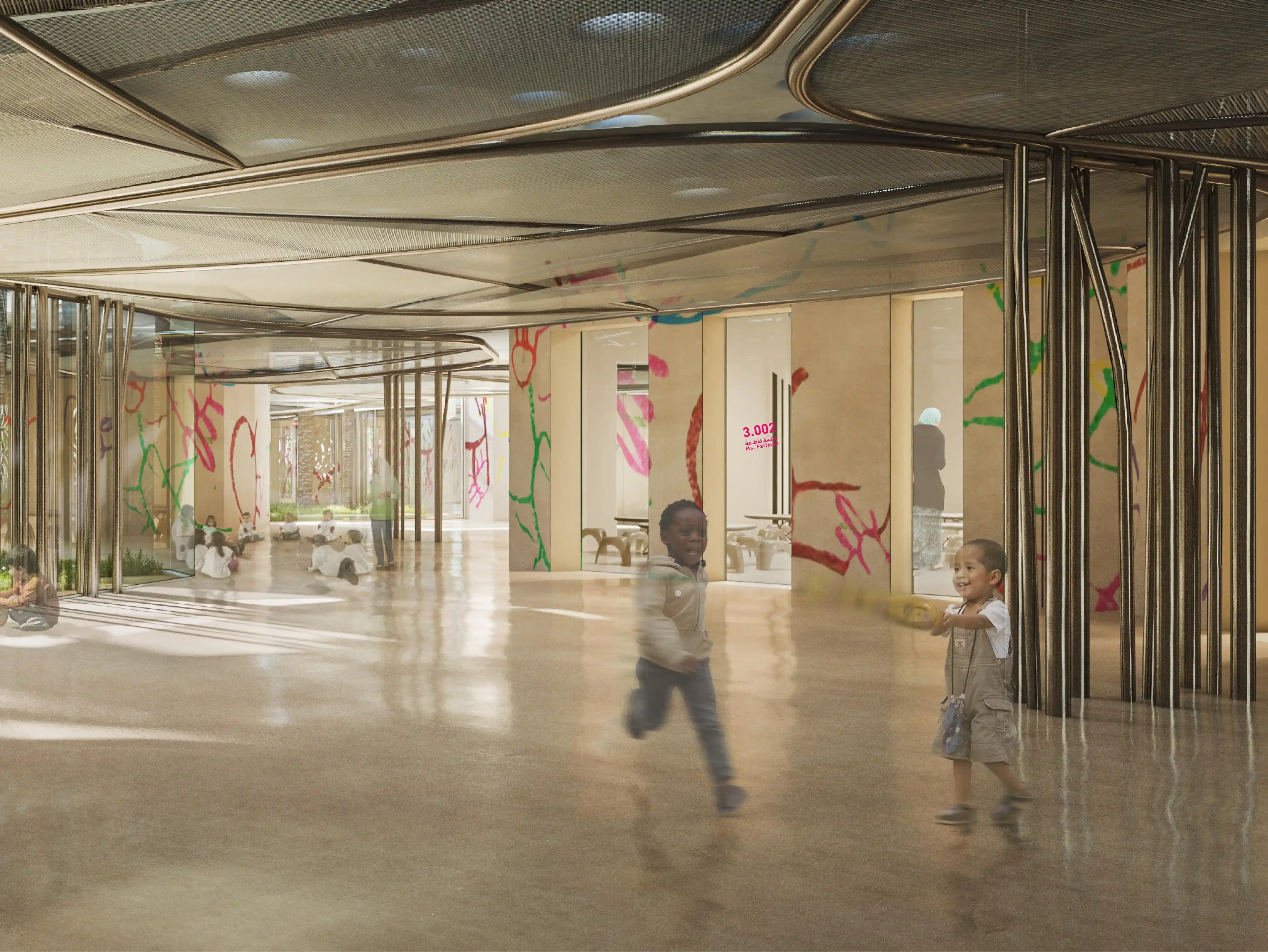
Large-scale building graphics, colour-led identifiers, and diagrammatic maps further strengthen orientation throughout the campus, creating an environment where navigation feels approachable, confident, and connected to the school’s identity.

FEATURE MOMENT

The Dar Al Marefa experience is shaped through a series of playful and highly legible navigational interventions designed to support confidence, independence, and everyday clarity across the campus.

‍

COLOUR-LED ZONING

Each building adopts a distinct colour identity connected to the school’s wider visual language. Applied consistently across signage, maps, and architectural touchpoints, colour becomes a powerful tool for orientation and recognition.

‍

BUILDING IDENTITY SYSTEM

Naming and numbering strategies create a structured yet flexible framework that helps users understand the campus intuitively while allowing the school to reinforce its educational identity through playful terminology.

‍

ARCHITECTURAL DIRECTIONALS

Pedestrian directional signage takes inspiration from the campus shading structures, using multi-faceted forms that improve visibility while integrating seamlessly within the architectural environment.

No items found.

The Dar Al Marefa wayfinding strategy creates a clear and engaging framework that supports everyday movement across a complex educational environment. Through zoning, colour, architectural integration, and expressive graphic systems, the project strengthens orientation while fostering confidence, curiosity, and belonging throughout the campus, creating exceptional human experiences.

Pedestrian Directional Signage at Dar Al Marefa in Dubai, designed by LIMAH
Project
/

Dar Al Marefa

Dubai, UAE

Dar Al Marefa
2018
Project
/

Dar Al Marefa

Dubai, UAE

Located in Dubai within the Al Khawaneej district, Dar Al Marefa is a bilingual IB curriculum school designed to support learning through clarity, structure, and community. The campus brings together multiple buildings, age groups, and user types, including students, teachers, parents, staff, and visitors within a dynamic educational environment that balances academic focus with everyday ease of movement.

Working in collaboration with Muraba, we developed a comprehensive wayfinding and signage strategy across interior, exterior, parking, and back-of-house environments. The project focused on creating intuitive navigation systems that reinforce the school’s identity while supporting confidence, independence, and accessibility from first arrival.

Our approach combined zoning, colour, numbering, and expressive graphic systems to create an environment that feels welcoming, legible, and engaging for users of all ages.

‍

STRATEGIC DRIVERS

  • Supporting intuitive movement across a multi-building educational campus
  • Creating clear orientation systems for students, parents, visitors, and staff
  • Establishing distinct building identities through colour, naming, and numbering
  • Integrating playful visual language without compromising legibility
  • Reinforcing the school’s identity through cohesive environmental graphics and signage

EXPERIENCE STRATEGY AND DESIGN

CAMPUS MOVEMENT

We began by studying how people move through the campus on a daily basis. Arrival sequences, pedestrian routes, drop-off zones, and internal circulation paths were carefully mapped to identify key decision points, areas of hesitation, and moments where reassurance or additional clarity may be required.

These movement studies became an important coordination tool across the wider design team, helping identify both opportunities and constraints throughout the site. Rather than relying solely on signage placement, the strategy focused on understanding movement behaviours and creating a system that supports navigation naturally through the built environment.

‍

ZONING STRATEGY

The campus was organised into a series of clearly defined zones based on function, destination, and building identity. Each building was assigned a unique combination of naming, numbering, and colour, allowing users to understand the campus as a connected collection of recognisable places.

Building names were intentionally designed to remain flexible, allowing the school to adopt playful or age-appropriate terminology aligned with its wider identity. Numbering systems provided a clear organisational framework that informed room identification, maps, and navigational signage across the site.

Colour became a central navigational tool throughout the campus. Each building adopted a distinct colour drawn from the school’s broader identity palette, applied consistently across signage, maps, and architectural touchpoints to support rapid orientation, particularly for younger students and first-time visitors.

‍

DESIGNING A PLAYFUL VISUAL LANGUAGE

The visual identity for the wayfinding system was intentionally expressive and energetic in response to the educational environment. Signage elements use stacked compositions of text, arrows, numbers, and pictograms to create a graphic language that feels engaging and accessible while maintaining clarity and legibility.

Pedestrian directional signage draws inspiration from the structural shading elements within the campus architecture. Messages are distributed across multiple angled surfaces that improve visibility while reinforcing the geometry and rhythm of the built environment.

Large-scale building graphics, colour-led identifiers, and diagrammatic maps further strengthen orientation throughout the campus, creating an environment where navigation feels approachable, confident, and connected to the school’s identity.

No items found.

FEATURE MOMENT

The Dar Al Marefa experience is shaped through a series of playful and highly legible navigational interventions designed to support confidence, independence, and everyday clarity across the campus.

‍

COLOUR-LED ZONING

Each building adopts a distinct colour identity connected to the school’s wider visual language. Applied consistently across signage, maps, and architectural touchpoints, colour becomes a powerful tool for orientation and recognition.

‍

BUILDING IDENTITY SYSTEM

Naming and numbering strategies create a structured yet flexible framework that helps users understand the campus intuitively while allowing the school to reinforce its educational identity through playful terminology.

‍

ARCHITECTURAL DIRECTIONALS

Pedestrian directional signage takes inspiration from the campus shading structures, using multi-faceted forms that improve visibility while integrating seamlessly within the architectural environment.

No items found.

The Dar Al Marefa wayfinding strategy creates a clear and engaging framework that supports everyday movement across a complex educational environment. Through zoning, colour, architectural integration, and expressive graphic systems, the project strengthens orientation while fostering confidence, curiosity, and belonging throughout the campus, creating exceptional human experiences.

Pedestrian Directional Signage at Dar Al Marefa in Dubai, designed by LIMAH
Project
/

Dar Al Marefa

Dubai, UAE

PUBLIC ART
/
LA MER
2023
Project
/

Dar Al Marefa

Dubai, UAE

YEAR
2018
CLIENT
Dar Al Marefa
LOCATION
Dubai, UAE
SERVICES
Wayfinding & Navigation
,
Built Environment Integration
,
SECTOR
Education
,
Workplace
,
SHARE BY
https://pb-cb6cbd.webflow.io/projects/dar-al-marefa

Located in Dubai within the Al Khawaneej district, Dar Al Marefa is a bilingual IB curriculum school designed to support learning through clarity, structure, and community. The campus brings together multiple buildings, age groups, and user types, including students, teachers, parents, staff, and visitors within a dynamic educational environment that balances academic focus with everyday ease of movement.

Working in collaboration with Muraba, we developed a comprehensive wayfinding and signage strategy across interior, exterior, parking, and back-of-house environments. The project focused on creating intuitive navigation systems that reinforce the school’s identity while supporting confidence, independence, and accessibility from first arrival.

Our approach combined zoning, colour, numbering, and expressive graphic systems to create an environment that feels welcoming, legible, and engaging for users of all ages.

‍

STRATEGIC DRIVERS

  • Supporting intuitive movement across a multi-building educational campus
  • Creating clear orientation systems for students, parents, visitors, and staff
  • Establishing distinct building identities through colour, naming, and numbering
  • Integrating playful visual language without compromising legibility
  • Reinforcing the school’s identity through cohesive environmental graphics and signage
No items found.

CAMPUS MOVEMENT

We began by studying how people move through the campus on a daily basis. Arrival sequences, pedestrian routes, drop-off zones, and internal circulation paths were carefully mapped to identify key decision points, areas of hesitation, and moments where reassurance or additional clarity may be required.

These movement studies became an important coordination tool across the wider design team, helping identify both opportunities and constraints throughout the site. Rather than relying solely on signage placement, the strategy focused on understanding movement behaviours and creating a system that supports navigation naturally through the built environment.

‍

ZONING STRATEGY

The campus was organised into a series of clearly defined zones based on function, destination, and building identity. Each building was assigned a unique combination of naming, numbering, and colour, allowing users to understand the campus as a connected collection of recognisable places.

Building names were intentionally designed to remain flexible, allowing the school to adopt playful or age-appropriate terminology aligned with its wider identity. Numbering systems provided a clear organisational framework that informed room identification, maps, and navigational signage across the site.

Colour became a central navigational tool throughout the campus. Each building adopted a distinct colour drawn from the school’s broader identity palette, applied consistently across signage, maps, and architectural touchpoints to support rapid orientation, particularly for younger students and first-time visitors.

‍

DESIGNING A PLAYFUL VISUAL LANGUAGE

The visual identity for the wayfinding system was intentionally expressive and energetic in response to the educational environment. Signage elements use stacked compositions of text, arrows, numbers, and pictograms to create a graphic language that feels engaging and accessible while maintaining clarity and legibility.

Pedestrian directional signage draws inspiration from the structural shading elements within the campus architecture. Messages are distributed across multiple angled surfaces that improve visibility while reinforcing the geometry and rhythm of the built environment.

Large-scale building graphics, colour-led identifiers, and diagrammatic maps further strengthen orientation throughout the campus, creating an environment where navigation feels approachable, confident, and connected to the school’s identity.

No items found.